The Lardner Report

Unleash your creative superpowers!

  • Home
  • Creative Voltage Website
  • Contact
  • Archives
  • About

Pooling around

August 2, 2010 by Lonnie Lardner

Yes, art is everywhere. Even in the deep end.

(Pic #1) "Pool guy" with an eye?

I can’t help it. I was just sitting at a pool party in Woodland Hills, California this weekend, when I noticed it. There was something different about the bottom of my friend Natasha’s swimming pool. As it was explained to me—the pool repair dude wasn’t sure how to handle filling all the cracks–so he punted—and covered them all in sweeping thick intersecting lines. I shot a few iphone photos to share the moments of “cool blue art.”

(Pic #2) Stepping into abstraction

He may not have noticed—that from above–he created a sweet set of abstractions—reminiscent of blue chip painter Franz Kline (1910-1962). For kicks, I removed the color from the swimming pool “grab shot,” and juxtaposed the two. (Pic #3)

(Pic #3) Left: Franz Kline Painting, “Buttress” (1956) Right: Natasha’s “Deep end” photo (2010)

Look for it—I promise you it’s there.

Filed Under: Found Art Tagged With: art is what you see, creative inspiration, developing an eye for art, discover your own art, find art everywhere, Franz Kline art, stopping to look

Russia: First Impressions (Part 3)

July 24, 2010 by Lonnie Lardner

(Pic #1) "Abstract Duet" Russian street graffiti (left) paired with recent small pastel painting (right)

“Something old and something new”

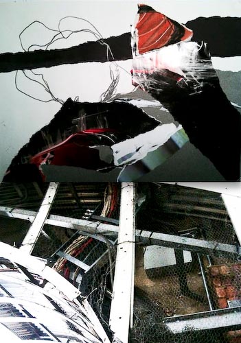
Visual jolts. That’s what I keep experiencing here in the “Venice of the North”—St. Petersburg. The textures and colors send my right brain into overdrive, and I have been inspired somehow to pair up what I’m now calling “abstract duets.”

Sometimes they’re marriages of images created in the early 1700s with images created as recently as last week. The pairing above (Pic #1) began with my fascination with common “tagging” on government signs, construction sites, and public buildings. I took this spray-painted, eye level electrical box (left) and digitally jammed it right into the side of a recent painting I’d done with Caran D’Ache Neocolor crayons and kids’ stickers.

(Pic #2) "Abstract Duet" Russian Museum painted ceiling border, 1895 (top) paired with contemporary outdoor graffiti (2010)

I grabbed these shots on the streets of St. Pete’s, its storied riverbanks, and inside the many of the opulent palace halls, state rooms, museums, and cathedrals.

They are juxtaposed with recent 10-minute alprazolam paintings I completed as an experiment in committing to daily art-making (see: “The 10-minute task,” and “50 paintings in 50 days”) or, with other photos from the same trip—which included stops in New York and the Tate Modern in London.

(Pic #3) "Abstract Duet" St. Petersburg rooftops (top) paired with moorings in Neva River (bottom)

I felt so inspired by these diverse images—anxious to see if they’d really work together—even in a very raw way.

(Pic #4) "Abstract Duet" Reflection, Church of the Resurrection (left) paired with recent collage/pastel (right) Photo on left by Anita Bartlett

(Pic #5) "Abstract Duet" 18th century St. Petersburg architecture (top) paired with recent 10-minute painting (bottom)

(Pic #6) "Abstract Duet" London construction site (bottom) paired with recent collage (top)

It’s just a matter of being aware…taking a moment to really see what’s around you… then, as the images pass though your personal creative filter—you get to see the birth of a fresh idea—that is uniquely yours.

Links:

Church of the resurrection.

Neva River.

Russian Museum.

Anita Bartlett.

Filed Under: Travel Tagged With: abstract duets, assemblage, finding inspiration, graffiti, painting and photography, Russian architecture, stimulating creativity, stimulating ideas, street art

Russia: First Impressions (Part 2)

July 23, 2010 by Lonnie Lardner

(Pic #1) The Winter Palace: Czarinas rule--in color.

Exploring Saint Petersburg–in living color

The first thing that strikes you as you navigate the bustling streets of St. Petersburg (the week of the annual St. Petersburg International Economic Forum) is the the mix of spirit-lifting colors on many of the 365 Imperial palaces here. Our tour guide, (a local historian with an enviable memory for detail) Zoye Tarasova, told me this region only gets “40 days of sun all year”–so it makes sense that the Czars and architects of the day (1700s) chose color to combat the sense of gray.

The Winter Palace and State Hermitage Museum sport what I  can only describe as Martha Stewart “Araucana Teal.” It’s not quite green, not quite blue–but a delicate mixture of the two. Now I’m sounding like Myrna Loy  in “Mr. Blandings Builds His Dream House.” If you missed that 1948 classic film with Cary Grant–I have to share the dialogue that always makes me smile. Mrs. Muriel Blandings (Loy) tries to describe to her house painters the kind of green she’d like in the living room, then the shade of yellow for the dining room…

                                     MURIEL
                         Now I want the living room to be a
                         soft green.
                                (PeDelford nods)
                         Not quite as bluish as a robin's
                         egg, but yet not as yellow as daffodil
                         buds.

                                     PEDELFORD
                         Mm.

                                     MURIEL
                              (handing him a sample)
                         The best sample I could get is a
                         little too yellow, but don't let
                         whoever mixes it go to the other
                         extreme and get it too blue. It should
                         just be sort of a grayish yellow
                         green.

                                     PEDELFORD
                              (making a note)
                         Mm-hmm.

                         (They turn to the dining room.)

                                     MURIEL
                         Now the dining room I'd like yellow.
                         Not just yellow, a very gay yellow.

                                     PEDELFORD
                         Mm-hmm.

                                     MURIEL
                         Something bright and sunshiny.
                              (sudden inspiration)
                         I tell you, Mr. PeDelford, if you'll
                         just send one of your workmen to the
                         A&P for a pound of their best butter
                         and match it exactly, you can't go
                         wrong.

                                     PEDELFORD
                              (making a note)
                         Mm.

                                     MURIEL
                         This is the paper we're going to use
                         here in the foyer.
                              (hands sample to him)
                         It's flowered but I don't want the
                         ceiling to match any of the colors
                         of the flowers. There are some voltaren little
                         dots in the background, and it's
                         these dots I want you to match. Not
                         the little greenish dots near the
                         hollyhock leaf, but the little bluish
                         dot between the rosebud and the
                         delphinium blossom. Is that clear?

                      (PeDelford looks carefully at the sample, then:)

                                     PEDELFORD
                              (making note)
                         Mm-hmm.

                                     MURIEL
                         The kitchen's to be white. Not a
                         cold, antiseptic hospital white -- a
                         little warmer but not to suggest any
                         other color but white.

                                     PEDELFORD
                              (note)
                         Mm.

                                     MURIEL
                         Now for the powder room, I want you
                         to match this thread.
                              (hands him thread)
                         You can see it's practically an apple
                         red. Somewhere between a healthy
                         Winesap and an unripened Jonathan.

                                     PEDELFORD
                              (making note)
                         Mm.

                        (There is a crash from the kitchen.)

                                     MURIEL
                         Will you excuse me?

               (Muriel hastily exits toward the kitchen. PeDelford turns to
               his assistant.)

                                     PEDELFORD
                         Got it, Charlie?

                                     CHARLIE
                              (deadpan; indicating
                              rooms with his thumb)
                         Green, yellow, blue, white, red.

                                     PEDELFORD
                         Check.

Almost all the Romanovs starting from Catherine the Great (a devoted supporter of the arts) resided in the Winter Palace–now home to the massive collection of the Hermitage Museum, which houses more than three million works of art and historical artifacts, including, the iconic “Dance” by Henri Matisse (Pic #6).

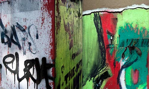
(Pic #2) Contemporary Russian street graffiti: color keeping pace with history

The distinctive shades of green, rust, dusty pinks, gold, and royal  blues–inside and out–in the palaces, cathedrals, museums, and on the streets, sent me spinning.

(Pic #3) Painted ceiling trim, Russian Museum, circa 1895

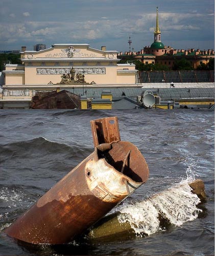
I started seeing colors I’d never seen before, and  interesting shapes and textures–everywhere. It’s why I had to stop to grab a few shots of Russian graffiti (Pic #2) on St. Petersburg streets and signs, as well as abandoned moorings in the Neva River. (Pic #4)

(Pic #4) Abandoned mooring, Neva River

Palace, church, and museum ceilings, walls, hallways, dishes, and Louis the XIV furniture, are all luxuriously adorned in gold. (Pic #7)

St. Isaac’s Cathedral took 40 years to complete–and once you see the art on the inside–you understand why. Many of the artisans who worked on the mammoth structure (1818-1858) never saw it completed. Check out  the painstaking work on the painted  dome that dominates the St. Petersburg skyline. (Pic #5).

I’m told one palace was painted a very specific shade of peach–because the czarina at the time favored a pair of peach colored gloves. I was born in the wrong era.

(Pic #5) St. Isaac's dome: Holy Spirit "dove" at center

(Pic #6) My "Matisse moment"at the Hermitage

(Pic #7) Gold and lapis bowl, Russian Museum

Filed Under: Travel Tagged With: Catherine the Great, color moods, color obsession, decorating diva, Henri Matisse, Martha Stewart, Mr. Blandings, Myrna Loy, psychology of color, Russian art, Russian churches, Russian graffiti, St. Isaac's cathedral, St.Petersburg, the right color, unexpected art

  • « Go to Previous Page
  • Page 1
  • Interim pages omitted …
  • Page 79
  • Page 80
  • Page 81
  • Page 82
  • Page 83
  • Interim pages omitted …
  • Page 85
  • Go to Next Page »

Subscribe here:

Categories

  • Art Table Tips
  • Artist Spotlight
  • Creative Zone
  • Eco-Art
  • Found Art
  • Newsmakers
  • Quotes
  • Reflections
  • Travel
  • Uncategorized

Archives

Hey Brubeck, Take THIS.

The Alien And The Volcano: Why Do Our Brains Need to Make Order Out of Chaos?

Wait — So How Do YOU Choose a restaurant?

Meet Creative Voltage!

Sometimes Your Cat Just Makes The Art FOR You

2026: Kicking Fear to the Curb

Choosing Gratitude. But for a paintbrush?

Every Page Is A Treasure: Discovering Plastikcomb

Calling all artists — INKTOBER is here! Whaaaaa?

Art From The Ashes

One Click — One Masterpiece?

When Art F*cks With Your Head

The Perfect One-Liner

Portland: A Tale Of One City – Through Two Lenses

Happy New Year!

Allowing The Moment To Emerge

How Can A 5-Year-Old Be My Muse?

Stunning, Simple Beauty

An Unexpected Collaboration With Nature

Pathetic Shoe Obsession: WTF?

Copyright © 2026 · Dynamik-Gen on Genesis Framework · WordPress · Log in