The Lardner Report

Unleash your creative superpowers!

  • Home
  • Creative Voltage Website
  • Contact
  • Archives
  • About

“Fifty Shades of Beige” — The Final Escape

June 30, 2016 by Lonnie Lardner

DSCF6888

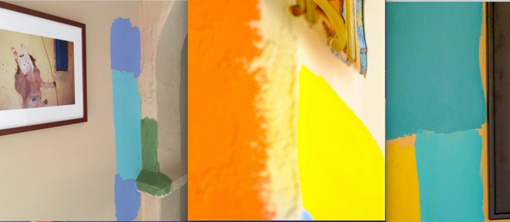
(Pic #1) A new face on our living room wall (left) “Tangerine Dream” paint by Benjamin Moore. Photo by Josh Kaplan.

At home: my spontaneous need to neutralize the neutrals.

Through the years of writing this blog, I’ve shared some names that are artistically significant to me. These are the names which have impressed me, or surprised me, but who have always inspired me. Names like Rauschenberg, Twombly, Frankenthaler, and Basquiat.
IMG_8508

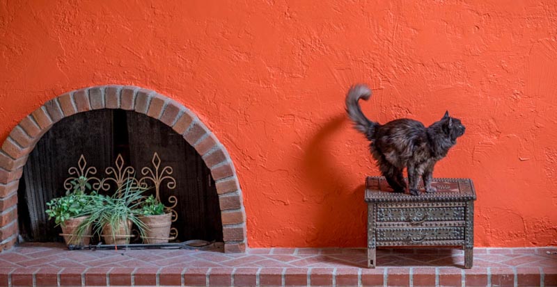
(Pic #2) From beige to blue: “Fidget” shows her preference with a point of her tail. We’ll be painting patio Door #2 tomorrow.

Today I add another name to that list: Benjamin Moore. Yeah, the paint manufacturer. Before you ask the question, no I’m not a paid spokesperson for the company (although if you ask my husband right now he would probably say a little money going the other direction between me and BenMo (as I’ve started to call it) wouldn’t be all bad.)
My husband is a music lover. Hearing certain artists’ voices changes something inside him. There is a visceral reaction to the tone and timbre of the music. It’s blissful. I have the same experience with color, and there is something about the richness of these paints that just makes my soul hum. So it’s a wonder it took 9 years of living in this house to “hit the wall” — with paint. Everything here is beige. Oh there are variations — light beige, medium beige and dark beige. And I know realtors will tell you that beige is not offensive, accepted by everyone, and more likely to showcase your home in a more appealing way. But I don’t care.
DSCF6910

(Pic #3) Close-up, “Tangerine Dream” wall approved by Fidget, age 14. Photo by Josh Kaplan.
The inspiration came to make a change when I saw how Mexican painter Frida Kahlo lived. Every room, every hall, every nook, inside and out, was covered in bright yellows, blues, lavenders, greens and reds. It’s as if she gardened clomid with her paint. Then the other night I was watching a TV guy pitching a Matisse print, and its astounding colors shouted out to me. I knew I had to make them the theme for our house. (Pic #4) They are considered a Fauvist palette. Super bright, pure color. Much like Frida’s home.
Matisse-the-Dance-1024x685

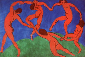
(Pic #4) “The Dance” by Henri Matisse (1910)

With that image stuck in my head, I ran out to OSH and bought 15 samples of wildly different BenMo paints. (I still get all giddy choosing between the billions of color sample cards in their racks.) I experimented with them all over our walls. And frankly, that might have been the ultimate  blast — getting to make a painterly mess — with permission…knowing something really cool was about to happen. The pathetic “beige-ness”of our home was about to be knocked on its boring bland ass.
While Josh was asleep, I managed to finish the one huge textured living room wall in Tangerine Dream, except for the 12-foot high top. He had no idea what I was up to. When he awoke, I got the thumbs up, and he encouraged me to keep going. I was so invigorated by the process, I could barely sleep. Covered in paint, my back aching, images of fresh paint in every color danced happily in my head. It was a perfect day.
DSCF6882-2

(Pic #5) Exploring shades of green

Today is Day 3, but this pop of color still has me smiling all day long. Makes me wish I could share the news with the millions of beige addicts out there… and perhaps, share the joy with my new BFF, Brooklyn’s own (late) Ben Moore, who I sense might be looking down fondly and saying, ‘What, are you nuts? It’s just paint.”
 
More?
Check out “20 Ways to Use Color Psychology in your home” here.
tests copy

(Pic #6) Testing is half the fun.
 

Filed Under: Creative Zone Tagged With: addicted to beige, beige vs: color, bucking the trend, do-it-yourself painting, house colors, painting your home, psychology of color

Russia: First Impressions (Part 2)

July 23, 2010 by Lonnie Lardner

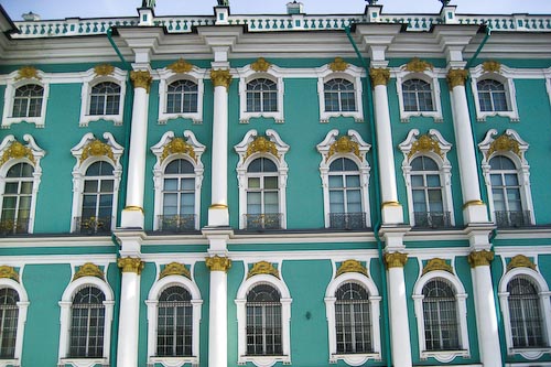
(Pic #1) The Winter Palace: Czarinas rule--in color.

Exploring Saint Petersburg–in living color

The first thing that strikes you as you navigate the bustling streets of St. Petersburg (the week of the annual St. Petersburg International Economic Forum) is the the mix of spirit-lifting colors on many of the 365 Imperial palaces here. Our tour guide, (a local historian with an enviable memory for detail) Zoye Tarasova, told me this region only gets “40 days of sun all year”–so it makes sense that the Czars and architects of the day (1700s) chose color to combat the sense of gray.

The Winter Palace and State Hermitage Museum sport what I  can only describe as Martha Stewart “Araucana Teal.” It’s not quite green, not quite blue–but a delicate mixture of the two. Now I’m sounding like Myrna Loy  in “Mr. Blandings Builds His Dream House.” If you missed that 1948 classic film with Cary Grant–I have to share the dialogue that always makes me smile. Mrs. Muriel Blandings (Loy) tries to describe to her house painters the kind of green she’d like in the living room, then the shade of yellow for the dining room…

                                     MURIEL
                         Now I want the living room to be a
                         soft green.
                                (PeDelford nods)
                         Not quite as bluish as a robin's
                         egg, but yet not as yellow as daffodil
                         buds.

                                     PEDELFORD
                         Mm.

                                     MURIEL
                              (handing him a sample)
                         The best sample I could get is a
                         little too yellow, but don't let
                         whoever mixes it go to the other
                         extreme and get it too blue. It should
                         just be sort of a grayish yellow
                         green.

                                     PEDELFORD
                              (making a note)
                         Mm-hmm.

                         (They turn to the dining room.)

                                     MURIEL
                         Now the dining room I'd like yellow.
                         Not just yellow, a very gay yellow.

                                     PEDELFORD
                         Mm-hmm.

                                     MURIEL
                         Something bright and sunshiny.
                              (sudden inspiration)
                         I tell you, Mr. PeDelford, if you'll
                         just send one of your workmen to the
                         A&P for a pound of their best butter
                         and match it exactly, you can't go
                         wrong.

                                     PEDELFORD
                              (making a note)
                         Mm.

                                     MURIEL
                         This is the paper we're going to use
                         here in the foyer.
                              (hands sample to him)
                         It's flowered but I don't want the
                         ceiling to match any of the colors
                         of the flowers. There are some voltaren little
                         dots in the background, and it's
                         these dots I want you to match. Not
                         the little greenish dots near the
                         hollyhock leaf, but the little bluish
                         dot between the rosebud and the
                         delphinium blossom. Is that clear?

                      (PeDelford looks carefully at the sample, then:)

                                     PEDELFORD
                              (making note)
                         Mm-hmm.

                                     MURIEL
                         The kitchen's to be white. Not a
                         cold, antiseptic hospital white -- a
                         little warmer but not to suggest any
                         other color but white.

                                     PEDELFORD
                              (note)
                         Mm.

                                     MURIEL
                         Now for the powder room, I want you
                         to match this thread.
                              (hands him thread)
                         You can see it's practically an apple
                         red. Somewhere between a healthy
                         Winesap and an unripened Jonathan.

                                     PEDELFORD
                              (making note)
                         Mm.

                        (There is a crash from the kitchen.)

                                     MURIEL
                         Will you excuse me?

               (Muriel hastily exits toward the kitchen. PeDelford turns to
               his assistant.)

                                     PEDELFORD
                         Got it, Charlie?

                                     CHARLIE
                              (deadpan; indicating
                              rooms with his thumb)
                         Green, yellow, blue, white, red.

                                     PEDELFORD
                         Check.

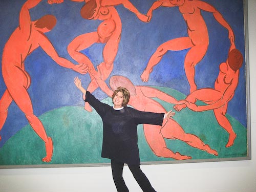
Almost all the Romanovs starting from Catherine the Great (a devoted supporter of the arts) resided in the Winter Palace–now home to the massive collection of the Hermitage Museum, which houses more than three million works of art and historical artifacts, including, the iconic “Dance” by Henri Matisse (Pic #6).

(Pic #2) Contemporary Russian street graffiti: color keeping pace with history

The distinctive shades of green, rust, dusty pinks, gold, and royal  blues–inside and out–in the palaces, cathedrals, museums, and on the streets, sent me spinning.

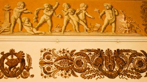
(Pic #3) Painted ceiling trim, Russian Museum, circa 1895

I started seeing colors I’d never seen before, and  interesting shapes and textures–everywhere. It’s why I had to stop to grab a few shots of Russian graffiti (Pic #2) on St. Petersburg streets and signs, as well as abandoned moorings in the Neva River. (Pic #4)

(Pic #4) Abandoned mooring, Neva River

Palace, church, and museum ceilings, walls, hallways, dishes, and Louis the XIV furniture, are all luxuriously adorned in gold. (Pic #7)

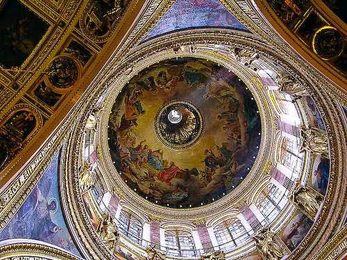
St. Isaac’s Cathedral took 40 years to complete–and once you see the art on the inside–you understand why. Many of the artisans who worked on the mammoth structure (1818-1858) never saw it completed. Check out  the painstaking work on the painted  dome that dominates the St. Petersburg skyline. (Pic #5).

I’m told one palace was painted a very specific shade of peach–because the czarina at the time favored a pair of peach colored gloves. I was born in the wrong era.

(Pic #5) St. Isaac's dome: Holy Spirit "dove" at center

(Pic #6) My "Matisse moment"at the Hermitage

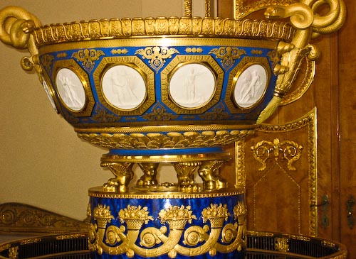
(Pic #7) Gold and lapis bowl, Russian Museum

Filed Under: Travel Tagged With: Catherine the Great, color moods, color obsession, decorating diva, Henri Matisse, Martha Stewart, Mr. Blandings, Myrna Loy, psychology of color, Russian art, Russian churches, Russian graffiti, St. Isaac's cathedral, St.Petersburg, the right color, unexpected art

Subscribe here:

Categories

  • Art Table Tips
  • Artist Spotlight
  • Creative Zone
  • Eco-Art
  • Found Art
  • Newsmakers
  • Quotes
  • Reflections
  • Travel
  • Uncategorized

Archives

Hey Brubeck, Take THIS.

The Alien And The Volcano: Why Do Our Brains Need to Make Order Out of Chaos?

Wait — So How Do YOU Choose a restaurant?

Meet Creative Voltage!

Sometimes Your Cat Just Makes The Art FOR You

2026: Kicking Fear to the Curb

Choosing Gratitude. But for a paintbrush?

Every Page Is A Treasure: Discovering Plastikcomb

Calling all artists — INKTOBER is here! Whaaaaa?

Art From The Ashes

One Click — One Masterpiece?

When Art F*cks With Your Head

The Perfect One-Liner

Portland: A Tale Of One City – Through Two Lenses

Happy New Year!

Allowing The Moment To Emerge

How Can A 5-Year-Old Be My Muse?

Stunning, Simple Beauty

An Unexpected Collaboration With Nature

Pathetic Shoe Obsession: WTF?

Copyright © 2026 · Dynamik-Gen on Genesis Framework · WordPress · Log in