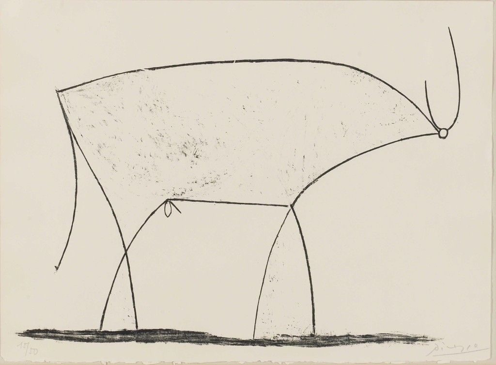
(Pic #1) The Bull, Lithograph by Pablo Picasso, 1945 / Inspiration for Mac sleek.
Twelve lines — and there it was.
It seems almost impossible to fathom, but just one defiant Spanish artist revolutionized the way a multi-billion dollar industry designs its products, and changed the way we all work. Pablo Picasso, the irreverent, most trailblazing painter and sculptor of the 20th century, continues to shape style and function, nearly half a century after his death.
The series of bull drawings below, explain how. And why Apple, Inc. is still “all in.”
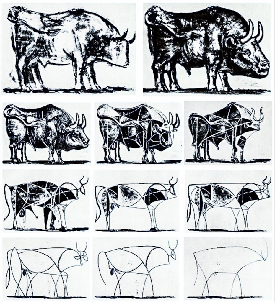
(Pic #2) “The Bull” (lithograph series) Pablo Picasso, 1945
Picasso pretty much defined minimalism through these eleven drawings…starting with a fairly realistically rendered bull up top, and ending with a handful of lines that evoke the animal’s “essence” at the bottom. The series is a step-by-step illustration of how to break an image down into its most basic parts.
Today, Apple incorporates these lithographs into its internal, highly secretive training program.
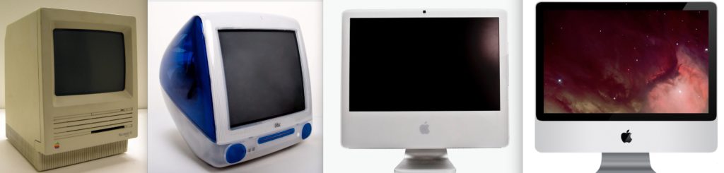
(Pic #3) Steve Jobs: “Let’s make it simple. Really simple.”
Jonathan Ive, head of design under Steve Jobs, describes the process of creating one of Apple’s Power Macs: “We wanted to get rid of anything other than what was absolutely essential,” he said. “We kept going back to the beginning, again and again. Do we need that part? Can we get it to perform the function of the other four parts?”
+++++++++++++++++++++++++++++++++++++++++++++++++++++++++++++++++++++++++++
The relationship between Apple and the prolific painter was exposed in a New York Times article in 2014. The Apple Uiniversity course on communication (taught by Randy Nelson, the former dean of Pixar University) focused on all 11 versions of “The Bull.” His point was: you rip through dozens and dozens of iterations until you can simply deliver your message in a concise way. The Apple brand has stayed true to that philosophy, ever since.
As the former Apple CEO explained: “The way we’re running the company, the product design, the advertising, it all comes down to this: Let’s make it simple. Really simple.”
+++++++++++++++++++++++++++++++++++++++++++++++++++++++++++++++++++++++++++
Fun fact: Steve Jobs was influenced by 20th-century European artists. In fact, the original Mac logo from 1984 was inspired by Picasso’s contemporary and sometimes rival, Henri Matisse.

Fascinating. Was unaware of the connection.
Paul,
Kinda blew my mind too…. art seems to connect everything… Thanks for reading… Lonnie